The Case For Beer Labels Being "Too Good."
Wednesday, Apr 23, 2025
So the next time a client asks, “What if the design is too good?”—don’t be so quick to internally scoff.
So the next time a client asks, “What if the design is too good?”—don’t be so quick to internally scoff.
A few years ago, when I was working at an agency, we got an interesting concern from a client after a presentation. It was the first round of a brand suite showcase for an up-and-coming brewery in Philadelphia. As you might expect, the presentation unveiled all the usual goodies a beer client could hope for—merch, label designs, unit mockups, tap handle renderings, and distributor displays.
Overall, the concepts and proposed materials were well received. But then, a hand in the back of the room slowly raised—somewhat reluctantly.
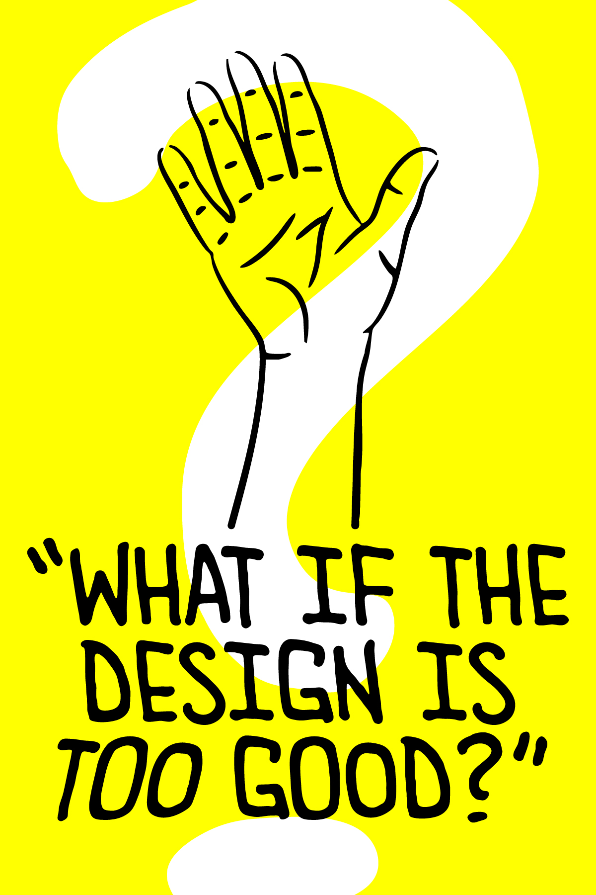
“What if the design is too good?”
To a room full of designers at a branding agency, the thought was almost laughable—at first. In the moment, we went on to explain that good design is never a liability. In fact, there are plenty of cases where the pedigree of a brand’s design can elevate the perceived quality of the product itself—even if the product’s actual caliber isn’t exactly best-in-class.
Brand loyalty is a real thing. I have a handful of hero brands I look up to for a variety of reasons. That said, it almost always comes down to the quality of the product. That will always come first. If the product is an Ace, then good design is the King—it improves the odds of an already great hand.
In the beer space, I often think of the original wave of craft breweries in the U.S.—many of them based on the West Coast, though not exclusively. These brewing pioneers were all about quality and product first. They spared no expense to make their beers clean, delicious, and meticulously sourced from the best farms and vendors. Only after the liquid was perfected did the creative process begin. What’s the name? What goes on the label? Should it be canned or bottled?
Back in the late ’90s and early 2000s, when craft brewing was finding its stride, design was often an afterthought. But in 2025—with marketing and social media more influential than ever—there are plenty of instances where beers are named and designed before a recipe is even thought of. I’m sure you’ve had a beer with a great label that tasted pretty underwhelming. How many times have you picked up a beer with a poorly designed label, only to be pleasantly surprised what’s inside?
Sometimes, the line between “bad” design and memorable design gets a little blurry. We’re taught in design school that overlapping typography, too many fonts, clashing colors, excessive textures, or strange formatting are surefire ways to land your work in the wastebasket. But sometimes, those unsung mishaps—those odd design choices—end up making something stick in your mind more than a layout by even the most technically disciplined artist.
From my own experience, one of the first beers that comes to mind when I think of low-fidelity design is Bell’s Solsun. If that name doesn’t ring a bell—pun intended—it’s because Solsun was eventually rebranded as Oberon. You know the one: the beer you’re probably picturing right now, with its scribbly sun sporting a subtle smirk, wrapped in a burst of blue and orange, half-buried in sand next to your beach towel. The official, unofficial beer of the summer solstice.
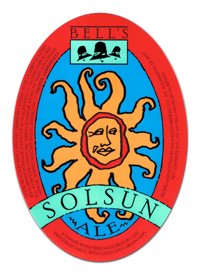
Over the years, Oberon has become a staple in the craft beer world thanks to its year-round appeal, even though its true release window runs from March to September. I’m sure the marketing team at Bell’s has had the same conversation countless times: How do we refresh this label? And when? The truth is, they can’t. There’s so much brand equity tied to that crude little depiction of the star our universe revolves around that any attempt to update it probably gets shut down faster than you can crush a 12oz can on the beach.
Will they ever change it? Maybe. Probably. But it’s easy to understand why they haven’t. The same can be said for another Bell’s legend—Two Hearted Ale (now Two Hearted IPA). Both are icons, juggernauts of the craft beer world. And yet, their labels aren’t exactly showstoppers. Still, you remember them. Can you imagine them any other way?
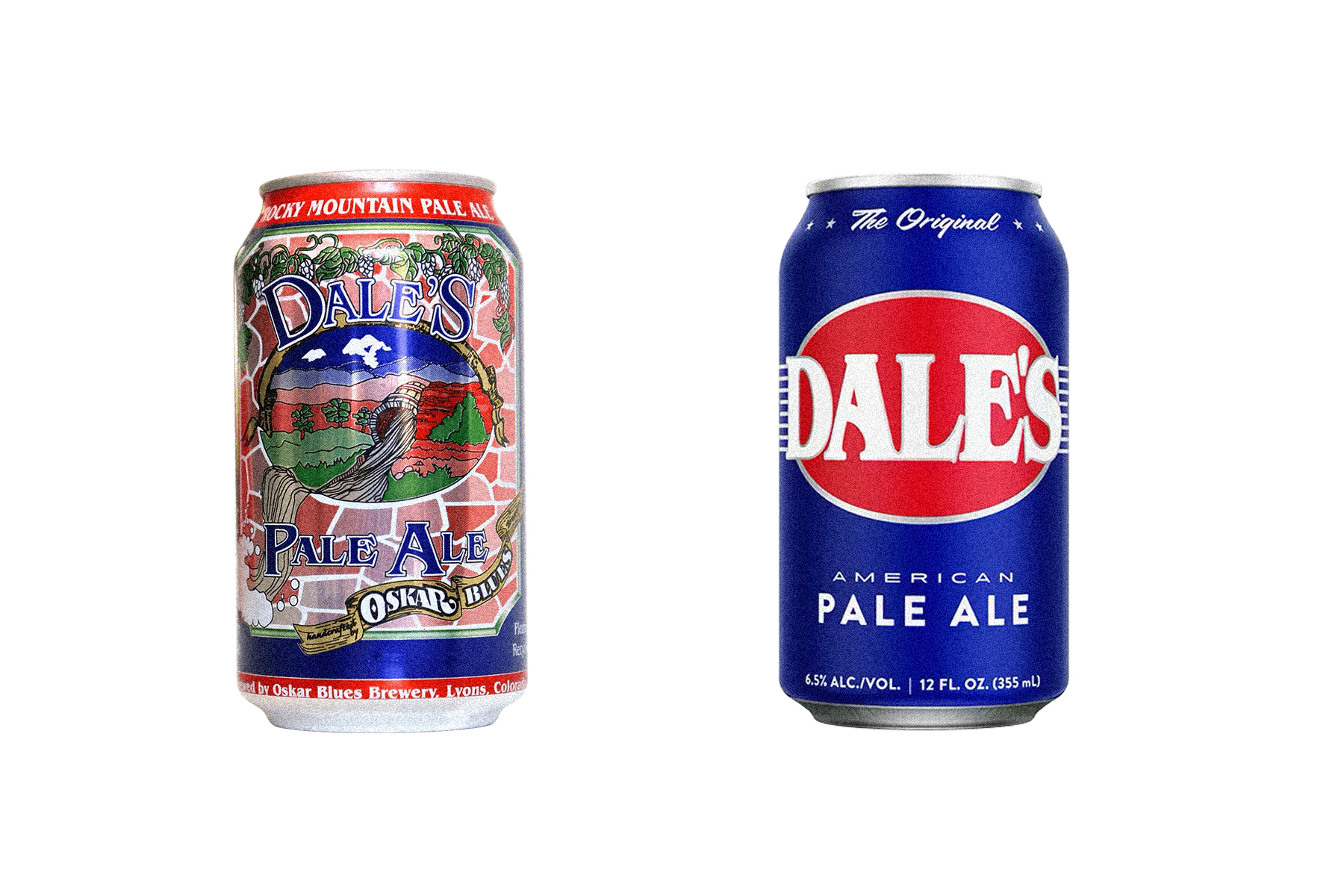
In a portrait of a cobblestone window, featuring a spring flowing from the mouth of a cask, backdropped by the Colorado Rockies, you’ll find another West Coast icon. Oskar Blues released Dale’s Pale Ale in 2002, one of the first canned craft beers in the U.S. The original can was covered in art nouveau elements–from the illustrated hop vines above, to the breaking ribbon below, this can took on the “more is more” approach.
Like most flagship products in any industry, recognition eventually opened the door to simplification. Over time, Dale’s evolved into a clean, bold design: primary blue, matched with red, and a flared serif that nods to the original label. That punchy color palette makes the can shine like a sapphire among the sea of options in a distributor cooler. Dale’s is a great example of a brand that was able to strip their imagery down to the studs, without losing equity or recognition.
Although I don’t claim to be a Cicerone®, a brewer, or any kind of expert, I’d like to think I have a pretty decent palate. I don’t keep a running list of every beer I’ve tried, and I don’t go out of my way to chase down bucket list brews. But if there’s a specific beer I’d like to try, and it happens to be near, I’ll definitely seek it out.
I usually lean toward West Coast or clear IPAs, but I don’t discriminate. Hazy, less-hopped, barrel-aged—I’m open to it all. That said, Pliny the Elder is still the best beer I’ve ever had. Of course, that’s just my opinion and personal bias, but I know I’m not alone in thinking that.
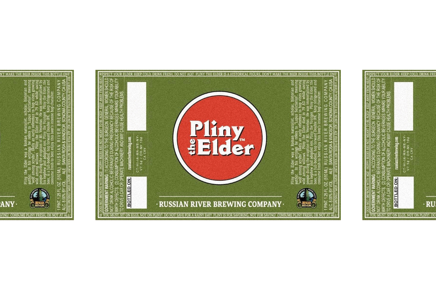
Russian River Brewing released Pliny back in 2000—a Double IPA housed in a 510mL brown bottle, wrapped in a forest green label with a red bullseye and enough typographic elements to make Dr. Bronner grin. Wrapped around the rectangular label are tongue-in-cheek messages like:
“RESPECT YOUR ELDER • KEEP COLD, DRINK FRESH, DO NOT AGE! PLINY THE ELDER IS A HISTORICAL FIGURE, DON’T MAKE THE BEER INSIDE THIS BOTTLE ONE!”
“NOT A BARLEYWINE, DO NOT AGE! AGE YOUR CHEESE, NOT YOUR PLINY!”
And that’s just the top and part of the right side. I’ll let you discover the rest on your own time.
In a world full of polished illustrations—camping scenes, mountain vistas, death metal vibes, and templated branding—Pliny stands alone. Its stripped-down green, white, and red color palette makes it instantly recognizable. A beacon for those in search of one of the best beers around.
The only reason you won’t find it in the cooler at your local bottle shop? It’s out of stock.
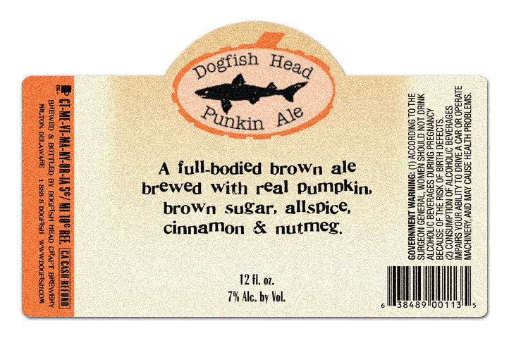
When it comes to flavor, there’s a particular time of year many people eagerly await—pumpkin spice season. As summer tapers off and the first crisp breeze dances through your hair, a primal temptation kicks in: the search for anything infused with cinnamon, brown sugar, cardamom, and pumpkin. In the brewing world, much of that seasonal craving can be traced back to Dogfish Head’s Punkin Ale.
First brewed in 1995, Punkin Ale took the industry by storm. Many have tried to replicate it, but few have captured lightning in a bottle the way Dogfish Head did. Like many of their early labels, Punkin Ale features playful serif typography that refuses to sit on the baseline—every letter bouncing like it’s over-caffeinated. Aside from a pop of color, the required legal text, and a crude pumpkin illustration surrounding the Dogfish logo, there isn’t much design. But the custom dieline and jittery type add just enough charm to catch your eye, setting it apart from all the other brews that fit the phrase “often imitated.”
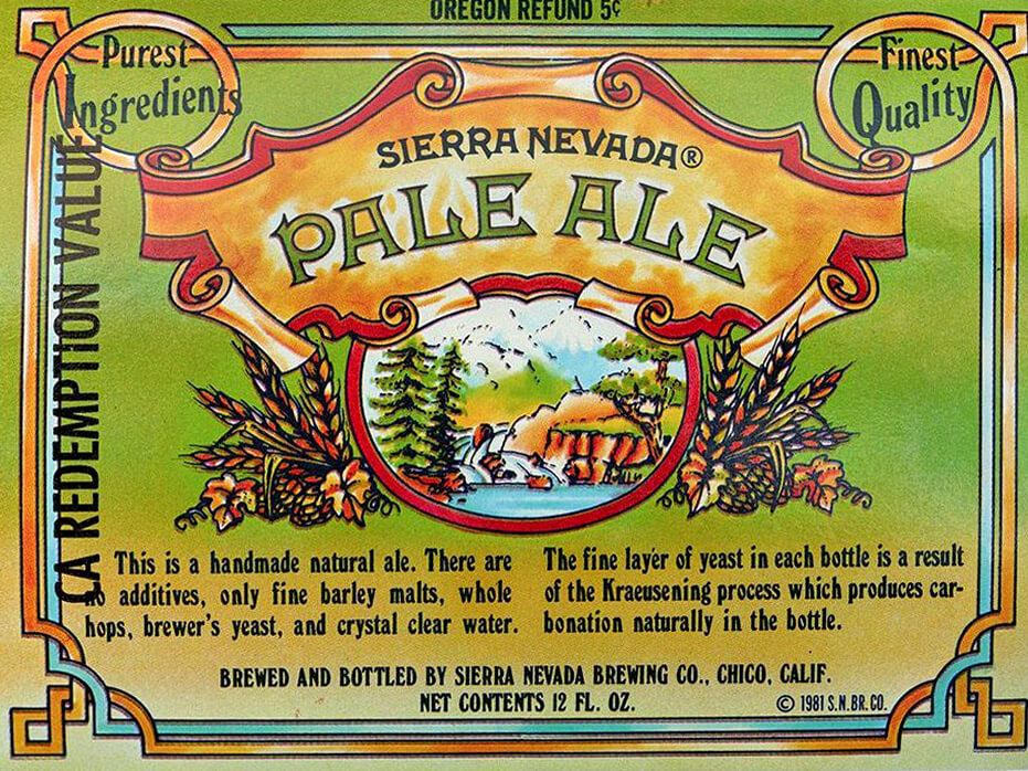
Much like the Art Nouveau-inspired design of Dale’s Pale Ale, another heavyweight from the West Coast embraced a similar aesthetic. In 1980, Sierra Nevada released its Pale Ale, a beer that’s now a staple wherever beer is sold. The original paper label wrapped around a short, stout brown bottle, boasting a hoppy green that fades into a straw yellow. It features another port-style window illustration—this time of a spring, with the presumed Sierra Nevada mountain range in the misty background.
Framed by Celtic knotwork and bold scrolls proclaiming the brewery’s name and “Pale Ale,” the label helped define a movement. Typographic elements like “Purest Ingredients” and “Finest Quality” overlap the design, seemingly unaware of the visual chaos they create. Designers who live and breathe type would probably mash their teeth at the rag-left-to-rag-right copy, complete with hyphenation and forced justification. While the illustrations are sound, they include elements of watercolor, blotchy shading, and fringed linework. These imperfections add a warmth and artisanal dynamic to the label, giving the impression that what you’re drinking will taste like the art that graces the bottle – bright, colorful, and majestic. Which are all true for this pale ale.
Most of these beers were born out of passion—brewed as an expression, not necessarily as a means of profit. Where these breweries poured their heart and soul into the liquid, designers now find themselves doing the same for the labels that surround the beers. During the original craft era, I think it’s safe to say that many brewers would chuckle at the thought of making a living brewing beer, but would be more than happy to hear that it’s possible. Back in the early days of craft beer, marketing and branding weren’t part of the equation the way they are now. And because of that, there’s a stark contrast between what you see rolling off the canning lines today versus what you’d find in the ’80s, ’90s, and early 2000s.
Today, it seems to be more about what sells than “what’s the best damn thing we can brew?” Although, that’s not the case for every brewery. You’ll find more intentional design, stronger color theory, and consistent branding now than ever before. Which is why, to me, the labels from the original craft boom are so much more interesting—even if they’d get torn apart by design students, marketing experts, and me.
I used to tell a former creative director that there’s a “good bad” and a “bad bad.” I’d put the examples above in the “good bad” category. They’re quirky, imperfect, and a little campy—but above all, they’re memorable.
So the next time a client asks, “What if the design is too good?”—don’t be so quick to internally scoff. Sit with it for a moment. You may find yourself falling down the rabbit hole and having somewhat of a career existential crisis, and question what you know to be industry truths.